 |
| I just love this one! |
 |
| Love this! Such pretty colors and scene and dress and a dapper fella. Actually, I have yet to see a Leyendecker guy that isn't dapper. |
 |
| Le sigh. |
 |
| Mhmm. Leyendecker knew how to paint handsome men just as well as beautiful women. |
 |
| Another favorite! |
 |
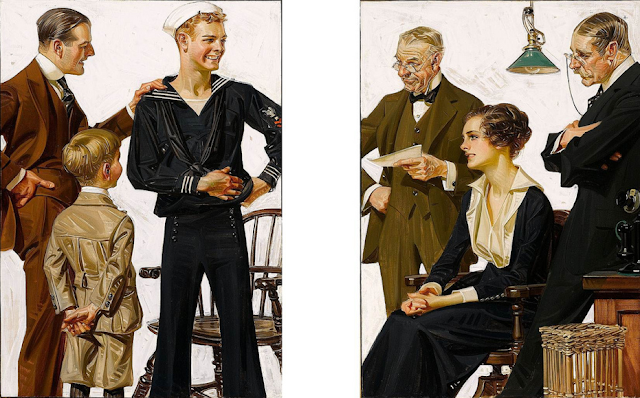
| Such a cute scene. And you can totally see where Rockwell was drawing his inspiration from. |
 |
| Another great one. This one also seems to be a good example of where Rockwell was influenced, in both the style and the sense of humor. |
 |
| He is also really good at using dramatic lighting. Not just here, but in many of the above. |


Oh, these are glorious. Can't decide which I love most. Swoon!
ReplyDeleteGreat stuff! I love best the gentleman with the cane seating on a sofa - it's almost as if I could touch the fabric of his suit! He's not too pretty either, and that works for me.
ReplyDeleteI've always loved these illustrations, but I didn't know who was responsible. The details are just so amazing. I love how his work is stylized but not minimalist.
ReplyDelete